You’ve heard the phrase “a picture is worth a thousand words.” It is well known and largely used because it tends to hold true. An image can depict an entire story without a single word. That is a pretty powerful super power that many companies don’t leverage enough in their digital marketing campaigns. Perhaps most importantly, creative imagery allows a viewer to layer their own personal interpretation on the visual, essentially personalizing the experience without you having to “spell it all out” for them.
In one of our most recent blogs, my colleague Urvi Shah outlined the main goal of most digital marketing campaigns: “…to immediately grab their (the viewers) attention and engage them in the action you want them to perform.” But what gets them from the social platform of choice to your landing page for them to download your report or watch a video? Our role as designers is to “move them to action” through an emotional connection.
Over the years, I have seen many companies focus 90 percent of their effort on the words surrounding their digital campaigns and 10 percent on the featured image that is typically paired with it. There is a misperception that the target audience scrolling through LinkedIn or Facebook (primarily on their phones) will be drawn in by long paragraphs describing what they want the viewer to click on. However, think of a time when you have been the viewer (most likely this morning with your morning coffee) and a large paragraph caught your eye on social media? What typically tends to stop our mindless scrolling?
The image.
A pop of color that grabs your attention from the endless paragraphs or rants.
An interesting or provocative scene that makes you stop and wonder what is going on in that snap shot of a moment. Harvard Business Review does an amazing job of this on their Facebook channel.
Once your attention has been captured then you’ll typically pay attention to the informative block of words. Think of the converse, would you stop to read an ad description (regardless of how compelling it may have turned out to be) if the image was horrible, cheesy or unprofessional looking?
If an image is worth a thousand words, then video is worth a million. However, when it comes to using video for digital campaigns, you’ll want them short and sweet (between 10-30 seconds) and styled appropriately for your target audience. Where fast-moving quick edits and grungy effects work for younger audiences, they run the risk of failure for C-suite professionals. As attention spans have shortened so has the amount of time you have to capture the eye of a potential client or customer.
Tips for Creating Eye-Catching Visuals:
- Use visuals that pertain to your target audience and campaign subject. The visuals should be creatively appealing and high quality (no low-resolution pixelated photos.)
- Don’t crowd your visuals with a ton of words. Once a visual has caught the viewer’s eye, then they will look at your description. The words you do use should be to the point and digestible at a glance.
- Be courageous with color. For example, Facebook can be a “sea of blue” so use complementary colors in your visuals to make them pop off the screen and differentiate them from the noise.
- To encourage engagement with your campaign, add a call to action (or CTA). Adding a CTA prompts the viewer to take the next step.
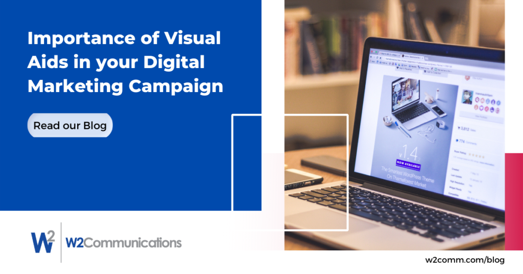
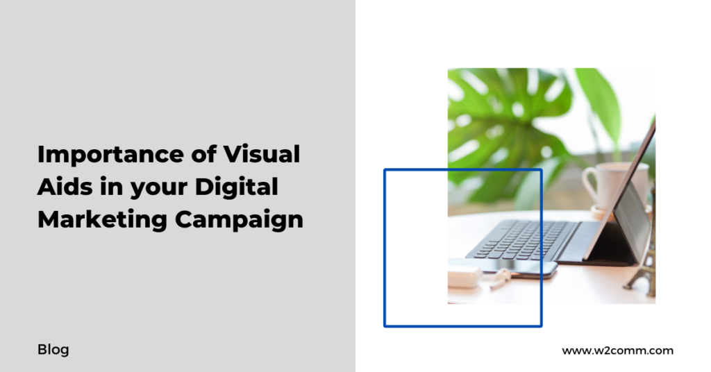
Take a look at the two images below. Which one are you more likely to click on?


With all of this in mind, I encourage you to take a few moments today as you scroll through our own social platforms to take notice of what makes you stop scrolling. Taking on the viewer’s role will help you understand what catches the eye and will help improve your future digital campaigns.


